Adapter
Card
Hardware
Router In Computer Network
Security
Sensor
Usb
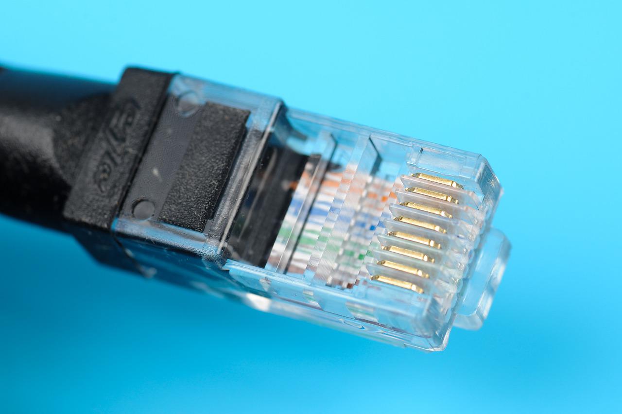
Networking Hardware in Computer network
Adapter
Card
Hardware
Router In Computer Network
Security
Sensor
Usb
Start typing to see results or hit ESC to close
See all results